Guerrilla marketing is easy to admire and hard to do well.
At its weakest, it’s a brand doing something weird in public and hoping people notice. At its best, it turns the environment into part of the idea: A bus shelter becomes a portal, a staircase becomes a piano, a manhole becomes a cup of coffee.
That’s the difference between a stunt and a marketing campaign worth studying.
So instead of ranking these campaigns by fame alone, we ranked them by marketing value: how useful they are for marketers to study and learn from.
The goal is to understand the creative move behind each stunt, which you could adapt (with a little creativity) for a different brand, audience, and moment.
How We Ranked These Campaigns
We started with a long list of contenders, compiled from multiple “Top 10” and “Best of” lists across the Internet. We then assigned each campaign a score out of 100 points, based on seven factors:.
- Visual or experiential impact
- Strategic clarity
- Success metrics
- Metric confidence
- Originality
- Marketing lesson value
- Risk control
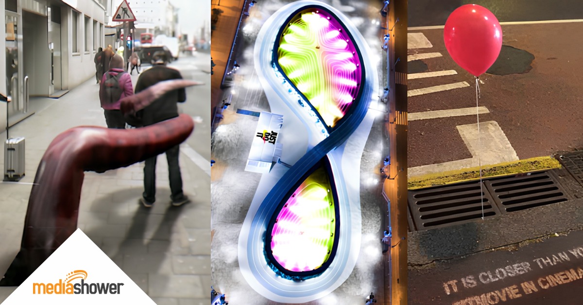
The Top 12 Guerrilla Marketing Campaigns
And here they are: our nominations for the 12 greatest guerrilla marketing campaigns in history, along with what ideas you can swipe for yourself.
1. BBC Dracula Billboard
Score: 93/100
Risk Level: Low
Metric Confidence: Strong
Swipeable Idea: Turn the environment into the reveal.
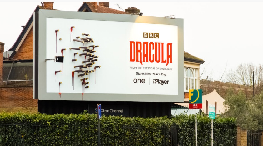
To promote BBC One’s Dracula, BBC Creative built a billboard that looked almost too simple during the day: a white board pierced by bloody wooden stakes. But once the sun went down, the stakes cast a perfectly arranged shadow of Dracula himself.
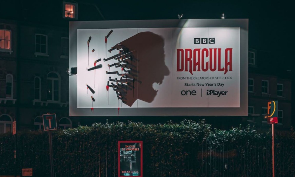
The reveal came from the media placement itself: the stakes, the lighting, the timing, and the night.
Success signal
Talon reports that the campaign generated more than 7 million video views and over 40 articles or content pieces. The execution also received coverage from creative and OOH industry outlets.
Why marketers still study it
The campaign used timing, light, and physical space as the creative engine. It didn’t need a paragraph of copy. It needed nightfall.
What to swipe
Use the environment as the reveal mechanism. Think lighting, weather, movement, shadows, location, sound, time of day, or audience behavior.
What not to swipe
A visual trick has to deepen the idea. Dracula appearing only at night is thematically perfect. A random shadow gag for tax software probably won’t hit the same.
Best used when
The campaign has a natural transformation, mystery, before-and-after, or reveal moment.
2. Pepsi Max “Unbelievable Bus Shelter”
Score: 91/100
Risk Level: Medium
Metric Confidence: Strong
Swipeable Idea: Make the impossible appear in an everyday place.
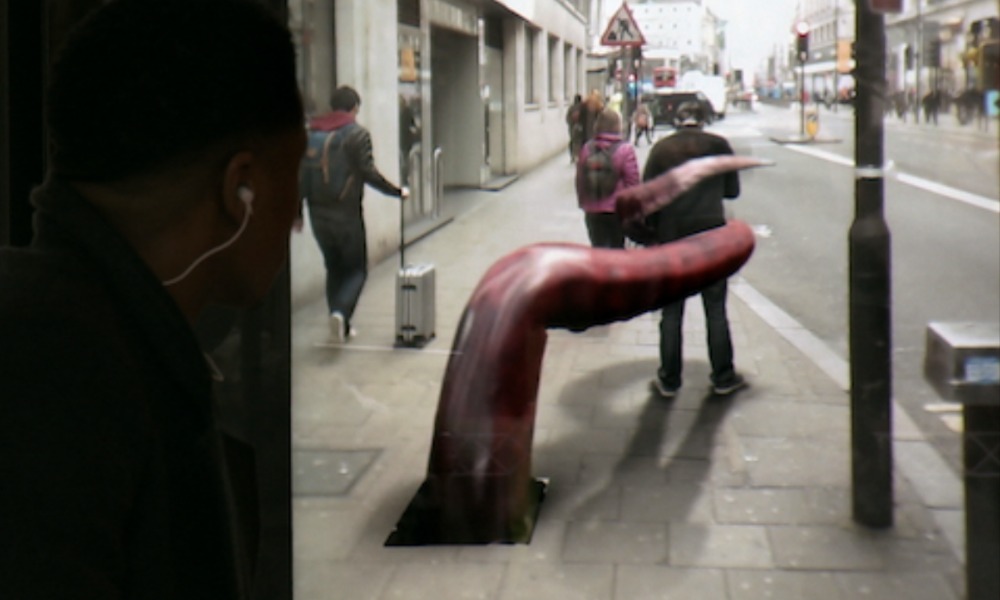
Pepsi Max turned a London bus shelter into an augmented-reality window. Commuters appeared to see alien abductions, robots, meteors, tentacles, tigers, and other impossible scenes unfolding on the street in front of them.
The stunt made the brand’s “unbelievable” message literal. A bus shelter is one of the dullest places in modern life. Pepsi made it ridiculous.
Success signal
Grand Visual reports that the campaign earned more than 8 million YouTube views, reached 3 million views in five days, generated PR coverage as far away as Brazil and Australia, and reached more than 385 million people.
Grand Visual also reported that Pepsi Max sales were up 35% year over year during the month the campaign ran.
Why marketers still study it
The technology served the concept. AR created the experience, while the strategic idea was simple: unbelievable things happening in an ordinary place.
What to swipe
Use technology to make the brand promise tangible, surprising, and easy to understand.
What not to swipe
AR, AI, projection, and other tech need a clear job. If the effect doesn’t strengthen the message, it’s just a budget with a software license.
Best used when
The product promise involves surprise, imagination, entertainment, transformation, or breaking from the ordinary.
3. 3M Scotchshield “Break the Glass” Bus Shelter
Score: 88/100
Risk Level: Medium
Metric Confidence: Moderate
Swipeable Idea: Prove the product claim in public.
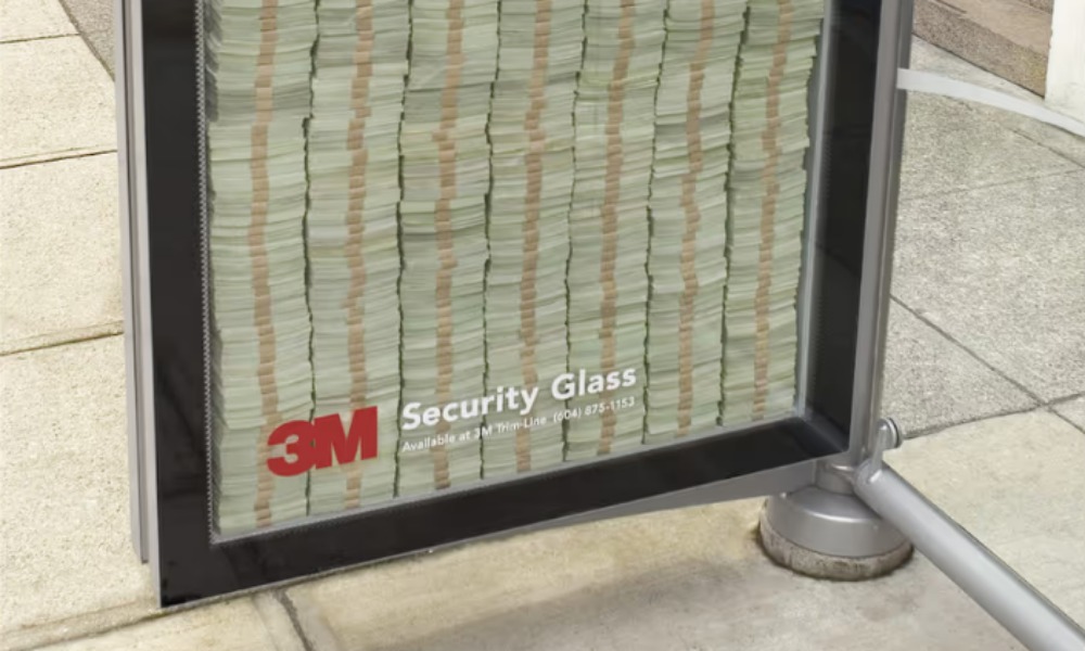
3M’s Scotchshield stunt placed what looked like millions of dollars in cash behind reinforced glass in a Vancouver bus shelter. Passersby were invited to try to break the glass using only their feet. If they could break it, the money was theirs.
That’s a product demo with teeth.
The real story is a little less mythic than the version that circulates online. The display did not contain $3 million in fully redeemable cash. Reporting and fact-checking indicate that only a smaller amount of real cash sat on top of fake bills, with a security guard nearby.
Even with that caveat, the strategic idea holds: the campaign turned a strength claim into a public challenge.
Success signal
Daily Hive reports that more than 100 people tried to break the glass, that the stunt generated an estimated $1 million in free publicity, and that the client saw a reported three-month order backlog.
Snopes verifies the core stunt while flagging the oversimplified “$3 million in bulletproof glass” version as mixed.
Why marketers still study it
A good product claim is abstract. A public test makes it concrete.
What to swipe
Turn a product promise into a proof point people can understand instantly.
What not to swipe
Avoid exaggerating the premise. Also avoid public challenges that could become unsafe, misleading, or legally messy. The line between “irresistible product demo” and “please don’t kick our bus shelter” is thinner than it looks.
Best used when
The product benefit can be demonstrated simply, safely, and publicly.
4. British Airways “Magic of Flying” / #Lookup
Score: 87/100
Risk Level: Low
Metric Confidence: Strong
Swipeable Idea: Connect the ad to the live world around it.
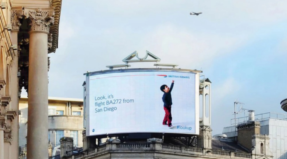
British Airways created digital billboards that reacted to actual BA planes flying overhead. When a plane passed, a child on the billboard pointed up at it while the screen displayed the flight number and destination.
It was outdoor advertising that felt awake.
The campaign connected the ad to a real moment happening above the audience. The sky became part of the placement.
Success signal
WPP reports that the campaign received 1.36 million video views, generated 45 million earned social impressions, and led to more than 364 news articles across 118 countries. WPP also reports that the campaign received 60 awards, including Grand Prix wins at the Clios and Cannes Lions.
Why marketers still study it
Context made the message emotional. The billboard pointed at the magic in real time.
What to swipe
Connect the ad to something happening in the real world at that exact moment.
What not to swipe
Live data should add meaning. Data for data’s sake is just a dashboard in public.
Best used when
A brand can connect its message to location, timing, weather, movement, events, or real-time behavior.
5. Volkswagen “Piano Stairs” / The Fun Theory
Score: 86/100
Risk Level: Low
Metric Confidence: Strong to moderate
Swipeable Idea: Make the desired behavior more fun than the default.
Volkswagen’s “Piano Stairs” transformed a staircase at Stockholm’s Odenplan subway station into a working piano keyboard. Instead of riding the escalator, commuters could climb the stairs and play music with their feet.
The campaign was part of Volkswagen’s larger “Fun Theory,” built around a simple behavioral idea: people are more likely to change behavior when the better choice feels enjoyable.
Success signal
Stanford Social Innovation Review reports that the Fun Theory videos earned about 13 million YouTube views within a couple of months, while the piano staircase video earned about 10 million views on its own. SSIR also reported that during the one-day test, 66% more people than usual chose the stairs over the escalator.
Why marketers still study it
The campaign turned behavior change into a reward.
What to swipe
Make the desired behavior more fun than the default behavior.
What not to swipe
Novelty and behavior design are different. The experience has to make the desired action easier, more appealing, or more rewarding.
Best used when
The campaign goal involves behavior change, participation, public interaction, or making a good choice feel more attractive.
6. Nike “Unlimited Stadium”
Score: 85/100
Risk Level: Low
Metric Confidence: Strong
Swipeable Idea: Let people experience the product promise.
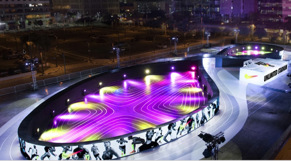
Nike built a full-sized LED running track in Manila shaped like the sole of the Nike LunarEpic running shoe. Runners could race against a digital avatar of themselves, turning a product launch into a physical challenge.
This is the high-budget end of guerrilla-inspired experiential marketing. It’s polished and ambitious. It also shows what happens when the physical environment becomes the campaign.
Success signal
- D&AD documents the campaign in its awards archive.
- Marketing Communication News reports that the campaign won 15 Cannes Lions.
Why marketers still study it
The audience didn’t just watch the product story. They ran inside it.
What to swipe
Let people experience the product promise physically.
What not to swipe
Scale is not strategy. This worked because the installation dramatized personal progress and competition.
Best used when
The brand promise is experiential, performance-based, competitive, or tied to personal growth.
7. Frontline “Get Them Off Your Dog” Mall Floor
Score: 82/100
Risk Level: Low
Metric Confidence: Limited
Swipeable Idea: Let the audience complete the visual.
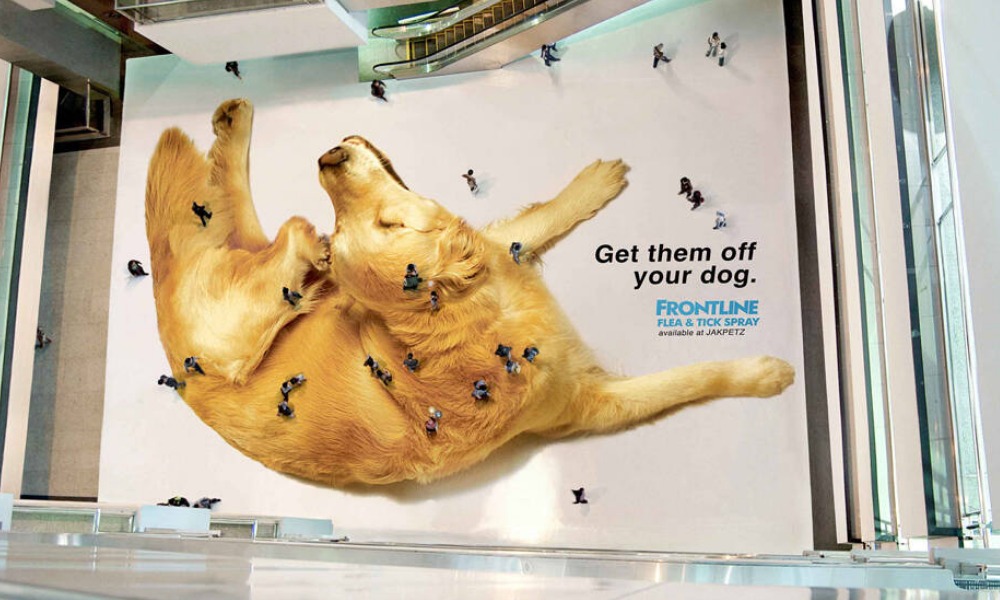
Frontline placed a giant image of a scratching dog across the floor of a Jakarta mall. From the ground level, shoppers saw a dog. From the upper floors, the people walking across the image looked like fleas crawling over the dog’s body.
The best part: the audience didn’t know they were part of the ad.
Success signal
Ads of the World documents the campaign as a 2009 ambient campaign in Indonesia created by Saatchi & Saatchi for Frontline. Public performance metrics are limited, which is why it ranks below campaigns with stronger documented results.
Why marketers still study it
The placement changed the meaning of ordinary audience behavior. Shoppers became the visual punchline.
What to swipe
Design the campaign around how people will encounter it from a specific angle, distance, or vantage point.
What not to swipe
The brand and product connection need to click quickly. Forced perspective works best when the product benefit lands fast.
Best used when
The campaign can use scale, perspective, movement, or audience presence to complete the idea.
8. IT Red Balloons
Score: 81/100
Risk Level: Medium
Metric Confidence: Moderate to strong
Swipeable Idea: Put a known symbol in the perfect physical context.
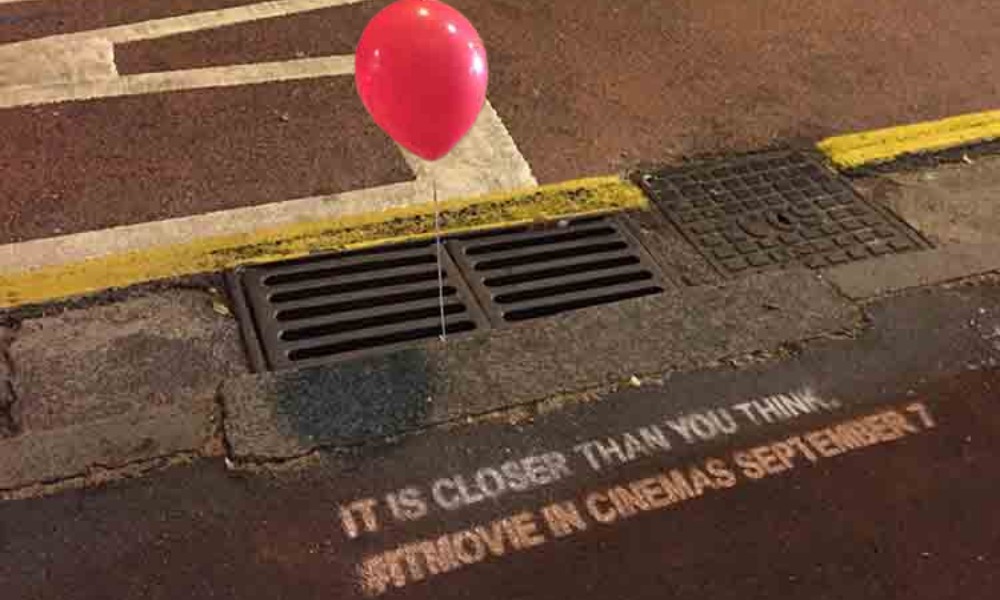
To promote the 2017 film IT, red balloons were tied to storm drains in Australian cities. The reference was immediate for anyone familiar with the character Pennywise. The placement made it worse — in the best possible way.
This was minimalist horror marketing: one object, one location, one collective shiver.
Success signal
Agency Mr. Glasses reports a conservative reach of 6.5 million in 24 hours, with images of the balloons spreading through news media, radio, TV, and social channels.
Why marketers still study it
The campaign trusted the audience to make the connection. It placed the symbol where it would feel most unsettling.
What to swipe
Use one unmistakable cultural cue in the right physical context.
What not to swipe
Fear, ambiguity, and public unease need a brand-fit reason and a controlled risk plan. Creepy is a strategy only when creepy is the point.
Best used when
The audience already recognizes the symbol, character, color, phrase, sound, or object being used.
9. UNICEF “Dirty Water” Vending Machines
Score: 79/100
Risk Level: Low
Metric Confidence: Moderate
Swipeable Idea: Make an abstract problem physically tangible.
UNICEF’s “Dirty Water” vending machines sold bottles labeled with diseases such as cholera, typhoid, and dysentery. The point was to make unsafe drinking water feel immediate.
For $1, passersby could donate to help children living without access to clean water.
Success signal
UNICEF USA documents the “Dirty Water” vending machine as part of the broader UNICEF Tap Project and notes that nobody drank the dirty water, but many donated. UNICEF USA also reports that the Tap Project helped bring safe water to more than 500,000 people.
Why marketers still study it
The campaign made a distant problem visible, physical, and hard to ignore.
What to swipe
Turn an abstract issue into a specific physical experience.
What not to swipe
Shock and discomfort should create empathy, understanding, and action. Guilt alone is a weak conversion strategy.
Best used when
The campaign needs to make a distant, invisible, or abstract issue feel immediate.
10. Folgers Steaming Manholes
Score: 77/100
Risk Level: Low to medium
Metric Confidence: Moderate
Swipeable Idea: Reframe an existing environmental cue.
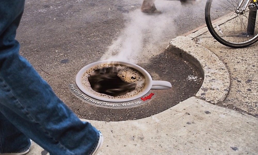
Folgers placed coffee-cup graphics over steaming New York City manholes so the steam appeared to rise from a hot cup of coffee. It was simple, funny, and instantly legible.
Of course, this is New York steam. The visual said “fresh coffee.” The nose may have had notes of subway dragon.
Success signal
Communication Arts reports that the Folgers manhole image and online discussion spread across hundreds of websites and blogs within two weeks of its appearance.
Why marketers still study it
The campaign noticed something already happening in the city and reframed it as a brand cue.
What to swipe
Look for existing environmental behavior the campaign can reinterpret.
What not to swipe
Sensory reality matters. If the smell, sound, temperature, or context fights the message, the joke may be on the brand.
Best used when
The environment already contains a physical cue that can be reframed into the campaign idea.
11. Copenhagen Zoo “Snake Bus”
Score: 75/100
Risk Level: Low
Metric Confidence: Limited
Swipeable Idea: Make the placement’s shape or motion do the work.
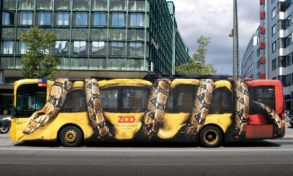
Copenhagen Zoo wrapped a city bus so it looked like a giant constrictor snake was crushing the vehicle. The idea was wonderfully direct: zoo animal meets city transit, and the bus becomes the visual.
No heavy copy. No complicated setup. Just a snake squeezing a bus.
Success signal
Ads of the World documents the campaign as a 2009 Denmark ambient campaign created by Y&R for Copenhagen Zoo. Hard performance metrics are limited, which keeps this lower in the ranking despite its strong visual impact.
Why marketers still study it
The campaign used the media format as part of the illusion. A flat poster could not have done the same job.
What to swipe
Use the shape, movement, or function of the placement as part of the idea.
What not to swipe
A spectacular visual still needs a measurable objective and a clear brand connection. A cool wrap is not automatically a campaign.
Best used when
The vehicle, object, or placement naturally supports the illusion.
12. GoldenToe Giant Underwear on NYC Statues
Score: 72/100
Risk Level: Medium
Metric Confidence: Moderate
Swipeable Idea: Make the product joke impossible to miss.
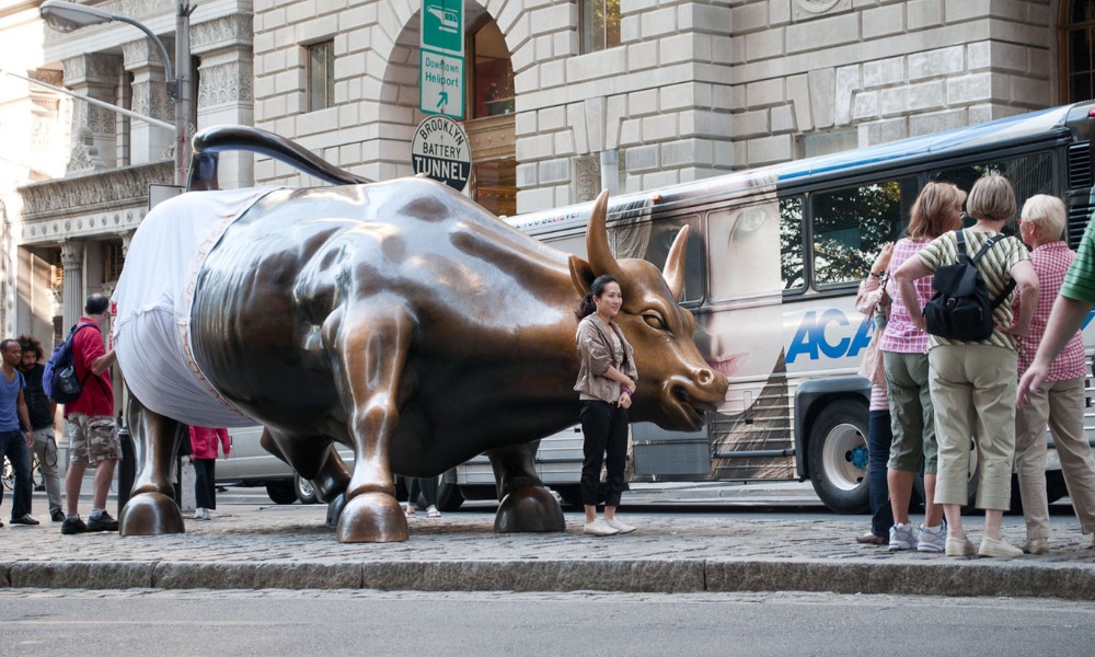
To launch a new underwear line, GoldenToe dressed public statues in New York City — including the Wall Street Charging Bull — in oversized underwear.
It was ridiculous, it was product-relevant, and it was very hard to ignore.
Success signal
PR Newswire confirms that GoldToeMoretz gave the Wall Street Bull a pair of branded underwear as part of the product launch. Event Marketer reported that the wider activation included underwear-clad brand ambassadors around the city and a launch event at Herald Square Park.
Why marketers still study it
The campaign made the product the joke. The underwear was the gag.
What to swipe
Use absurdity when the joke is immediately tied to the product.
What not to swipe
Random spectacle drains the idea. “People will take photos of this” is a starting point, not a strategy.
Best used when
The product is simple, visual, and easy to exaggerate in a way people instantly understand.
What Marketers Should Ask Before Borrowing These Ideas
Before you borrow from a guerrilla campaign, ask a harder question than, “Can we do something like this?”
Ask: “What made this work, and does that idea fit our brand, audience, objective, and risk tolerance?”
Does the medium add meaning?
The best guerrilla campaigns make the environment part of the concept. If the same idea could run anywhere, the placement probably is not doing enough work.
Can the idea be understood in one glance?
Public-space campaigns do not get much attention time. If the setup needs a paragraph of explanation, it may not survive contact with actual pedestrians.
What behavior are we trying to trigger?
Awareness, participation, donations, store visits, app downloads, social sharing, and press coverage all require different campaign choices.
What result would prove this worked?
A stunt without a measurement plan is just expensive theater. Define the success signal before the stunt goes live.
What could go wrong in public?
Surprise, ambiguity, physical interaction, hidden cameras, and public participation all introduce risk. The sharper the stunt, the more carefully the downside needs to be planned.
Is this swipeable as a principle?
The goal is to understand the underlying idea well enough to adapt it to a different brand, audience, and moment.
Marketer’s Takeaways
- Make the medium carry the idea. The best guerrilla campaigns use the setting, timing, object, movement, or audience behavior as part of the message.
- Design for one-glance understanding. Public-space campaigns have seconds to land. If the idea needs too much explanation, it’s probably too fragile.
- Swipe the principle, not the stunt. Don’t copy the shadow billboard, AR bus shelter, or giant underwear. Borrow the underlying move: reveal, reframe, prove, physicalize, or invite participation.
- Match the risk to the reward. Surprise can create attention, but public confusion, safety issues, legal exposure, or brand mismatch can turn a clever idea into a cleanup job.
- Plan the measurement before the spectacle. Views, press, participation, donations, sales lift, app downloads, and store visits are different goals. Choose the success signal before the campaign goes live.
- Use constraints as creative fuel. The strongest examples didn’t just overcome the location, format, or physical environment. They made those constraints the reason the campaign worked.