The Better Marketing Blog
Better tips, tools, and tactics for the AI era.
Better tips, tools, and tactics for the AI era.

Organic traffic is shrinking. AI tools are answering buyer questions directly, cutting into the traffic that used to flow to your website.
But LinkedIn carousels are one format still earning real engagement, because they require a choice.
When someone swipes a LinkedIn Carousel, they opt in. That changes the quality of attention. And quality attention is what builds the brand authority that gets surfaced inside LinkedIn, as well as AI systems like ChatGPT and Google AI Overviews.
Here’s how to build carousels that earn the swipe and the authority that follows.
Most social media platforms are engineered for doomscrolling. Content blurs together. Users consume passively, rarely pausing long enough to process what they see.
But the LinkedIn Carousel is different.
When someone swipes from slide one to slide two, they choose to continue. That choice changes the quality of engagement. It turns a passing impression into active consumption.
In a controlled experiment, Buffer replaced its standard text posts with carousel-only content for one week. They found that engagement quality improved. Comments increased, and shares climbed.
LinkedIn Engagement Rate by Post Type
| Post Type | Avg. Engagement Rate |
| Image carousel | 6.60% |
| Text-only carousel | 5.85%–6.10% |
| Video | 5.60% |
| Single image | ~3.85% |
| Text only | Lowest (trailing) |
Sources: SocialInsider LinkedIn Benchmarks 2025
Here’s everything we’ve learned from creating high-performing LinkedIn carousels for our clients (primarily B2B companies in the technology, finance, and healthcare industries).
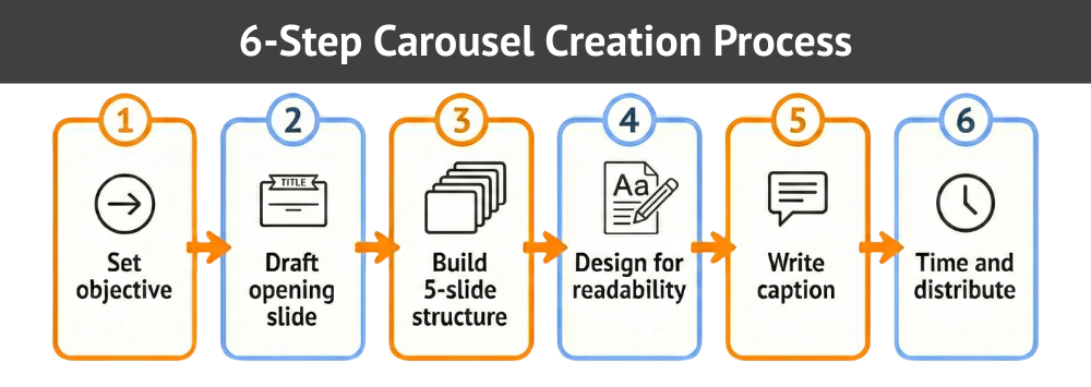
Deciding what a carousel should accomplish shapes everything: your slide count, your structure, your call to action, and the way you frame the opening slide.
Carousels that try to do too much usually don’t do anything well. The format rewards focus. The most effective carousels fit neatly into a single purpose:
Mixing unrelated ideas in a single carousel is one of the most common mistakes. If you find yourself wanting to cover two topics, split them into two posts.
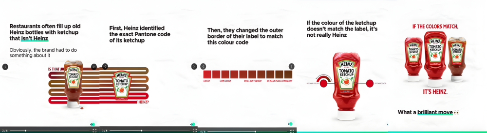
The first slide functions as a subject line. It either earns the swipe or it doesn’t.
A strong opening slide does three things: signals the value of what’s inside, makes a specific claim, and gives the reader a reason to continue.
Here is what the difference looks like in practice:
| Bad first slide example | Good first slide example |
| Thoughts on Content Marketing | 5 LinkedIn Post Formats Ranked by Engagement Rate |
| Content Tips for Busy Marketers | The One LinkedIn Post Type That Gets 3x More Comments (With Examples) |
| Some thoughts on growing your audience | How We Grew Our LinkedIn Following by 40% in 90 Days — Here’s What Worked |
One of the most common questions about LinkedIn carousels: How many slides should I use? The answer that consistently performs well is five. Fewer slides often lack enough substance to hold attention; more than seven tends to cause drop-off before the final slide.
The 5-slide format gives you enough room to hook, explain, support, illustrate, and close without overstaying your welcome.
The chart below maps the recommended sequence.
Opening slide
Vague headlines like “Some Thoughts on Content” lose people immediately. Something like “The 4-Slide Structure That Doubled Our Carousel Reach” tells the reader exactly what they’ll get. Show the content is actionable, not abstract.
Middle slides
This is where most carousels go wrong. Writers try to pack in too much, and readers lose the thread. The one-idea-per-slide rule forces better content.
Also, keep the visuals consistent. The reader’s attention will stay on the content instead of recalibrating to new formats.
Final slide
A strong final slide gives the reader somewhere to go. Invite them to share their perspective in the comments or direct them to your profile or newsletter. The specific direction matters less than having one.
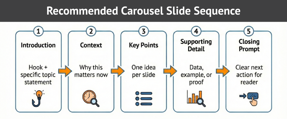
Here’s how it looks in practice.
Example: A marketing agency posts a carousel titled “3 LinkedIn Mistakes That Kill Your Reach.” Slide 1 is the title. Slides 2–4 each name one specific mistake with a one-line fix. Slide 5 invites readers to share their own experience in the comments. Every slide has one job, and each one earns the next swipe.
A carousel that looks impressive but requires effort to read will lose people by slide three. The goal is to make each slide feel effortless.
Typography and layout
Readable slides share common traits.
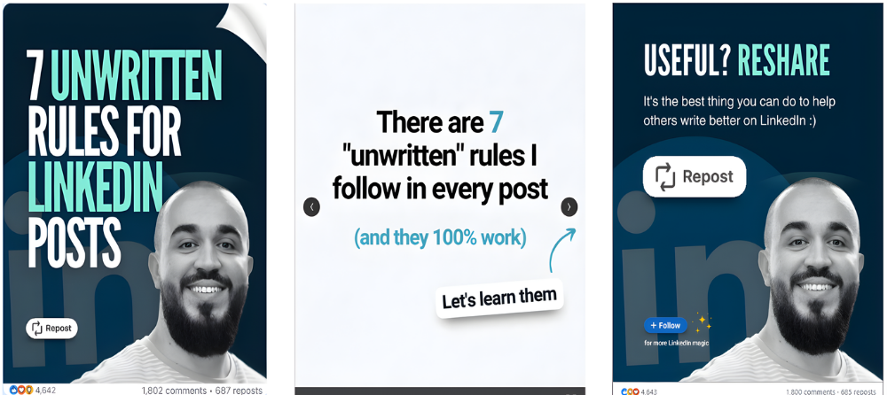
Brand presence
Subtlety performs better than dominance. A logo in the corner or a brand color palette applied across slides does the job. But a logo that takes up 30% of each slide competes with the content for attention.
Mobile optimization
Most LinkedIn users access the platform on a mobile device. If a reader must zoom to read a headline, the experience breaks. Test your slides on your own phone before publishing.

The carousel handles the substance, but the caption handles the context. They work together.
Instead of repeating the slides, a strong caption frames the topic and sets up the opening slide.
Provide context
Use the caption to establish relevance: What prompted this? What will the reader take away?
If the carousel is a research summary, state the key finding before the reader even swipes. If it’s a framework, explain the problem the framework solves. Two to four sentences are usually enough.
Encourage thoughtful responses
Invite a specific kind of comment. “What’s your experience with this format?” is far more likely to generate useful replies than “What do you think?” The more the question relates directly to the carousel’s content, the better the conversation it produces.
Caption examples
Weak caption (no context, no hook):
“Just posted our newest carousel. Let me know what you think! ♥️”
Strong caption (context + specific CTA):
“Most LinkedIn carousels lose people by slide three. Here is the five-slide structure we use at Media Shower to hold attention and drive comments. Swipe through, then tell us: which slide format gets the most engagement from your audience?”
Early engagement influences distribution. Posting at the right time increases the chance that your first wave of viewers interacts.
The golden hour
The most important window is not when you post. It’s what happens in the first hour after you post. LinkedIn’s algorithm treats early engagement as a signal that the content deserves wider distribution.
A carousel that earns comments, reactions, and shares in the first 60 minutes will be shown to a much larger audience than one that sits quiet.
Two actions make the biggest difference:
1. Engage fast. In the first hour after posting, respond to every comment. Even a short reply tells the algorithm that conversation is happening. This can significantly extend the life and reach of the post.
2. Seed the conversation. Post your carousel when you have 30–60 minutes to actively monitor and reply. If you post and go offline, you lose the compounding benefit of that early engagement window.
Timing still matters, but only to the extent that it puts your post in front of people who are likely to engage quickly. Publish when your specific audience is active. Check your LinkedIn Analytics for your own peak windows rather than relying on generic benchmarks.
Even experienced marketers trip on the same avoidable mistakes. Most of them are surprisingly easy to fix.
Dense slides overwhelm readers. Trim aggressively until each slide communicates one clear idea.
If the first slide lacks specificity, users will not swipe. Rewrite until the benefit feels concrete.
When you omit a call to action, attention disappears. Add a direct prompt aligned with your objective.
Shifting fonts, colors, and layouts create friction. Consistency builds trust and keeps focus on content.
LinkedIn rewards content that holds attention. Carousels do that better than almost any other format, but only when the opening slide earns the swipe, and the followup slides keep ‘em swiping.

Media Shower’s AI marketing platform helps you create LinkedIn content that earns the swipe. Click here for a free trial.